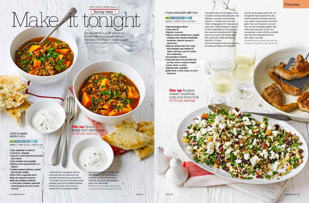
Article taken from BBC Good Food Magazine April 2014 addition. Recipes by Ren Behan. Photographs by Sam Stowell. Article found on Ren Behan’s website.
This article has many delicious and healthy meal recipes. Everyone has to eat and most people enjoy it, so this article appeals to a large audience. The type is simple and readable. The heading is integrated into the photography, which pulls you into the recipes. The wide heading and smaller columned recipes contrast well. The colorful food in the images contrasts with the white background.
The Types
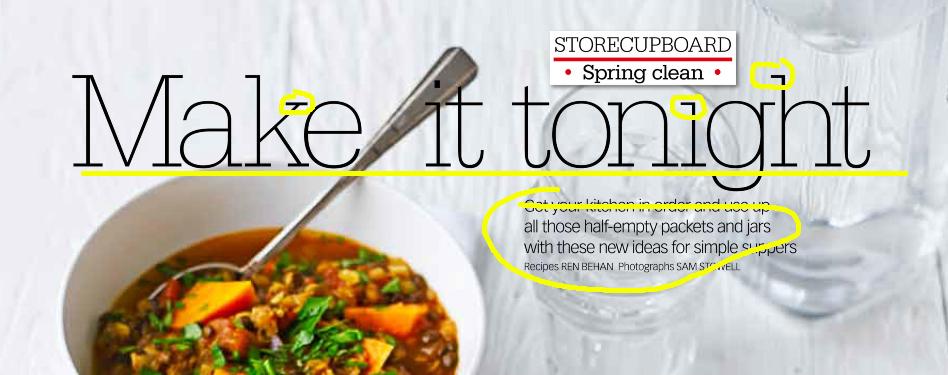
The title of the article is a Slab serif type face. This is obvious, because the letters have serifs, which I’ve circled. It is slab, not Oldstyle or Modern, because the letters don’t have thick and thin parts. They stay the same thickness anywhere on the letter.
The smaller text description of the article is a Sans serif. You can tell, because the letters don’t have serifs (small accents on the edges of the letters).
Type Contrasts
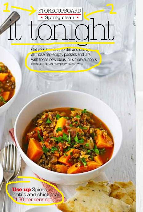
The types contrast in many ways. Arrows one and two show a difference in weight. Number two has a heavier weight than number one, or it is more bold. The underlined title contrasts in size to the circled description of the article. The type faces contrast in structure, because one has a serif and one does not. One also has a change in thickness as you follow the lines of each letter. The article uses color to contrast the type as well. Circled at the bottom of the page is a small eye-catcher with bold red type, next to thin black type. These contrast with the white background.
Rule of Thirds
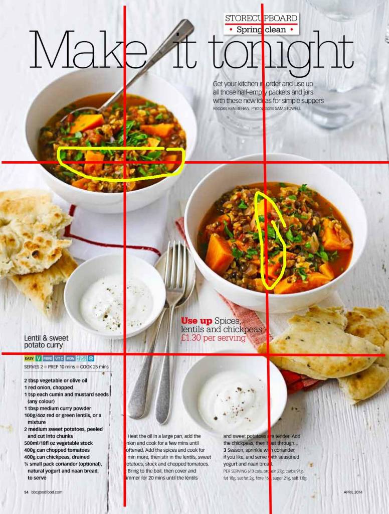
The photograph uses the rule of thirds to draw your eye to the soup. Both bowls sit on at least one line. However, they don’t sit on the same line, which I think makes it more visually appealing. Sitting on the same line would create too much symmetry or Asymmetry, depending on which line. What they have accomplished is a more organic look, which makes the food look ‘real’. The header is centered, but the label above it is directly on the right guide line.
My Photography
Phở
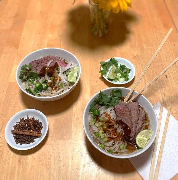
My Phở soup photograph mimics the arrangement of two servings of food with added food accents. I used the rule of thirds to place the bowls in a similar manner to the magazine spread image. It would replace the photo above, because it has a plain, simple background and you could ‘use up spices’ while making this recipe.
Italian Sandwich
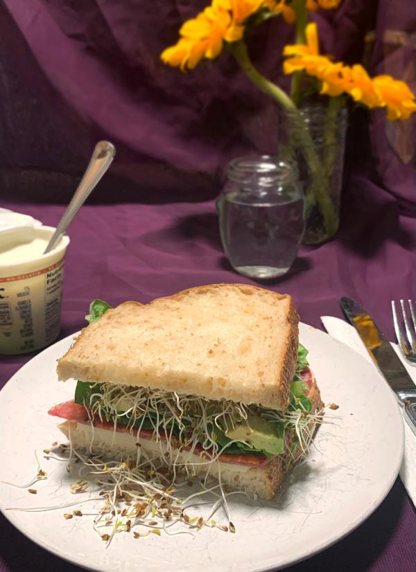
This Italian sandwich mimics the picture in the article by using background items to achieve more depth in the image. The center of the sandwich is on the bottom guide line and is the focal point. It could replace the picture in the above article, because it is made with many common items that you are likely to have in your fridge or on your counter. You could indeed ‘make it tonight’.
Zuppa Toscana
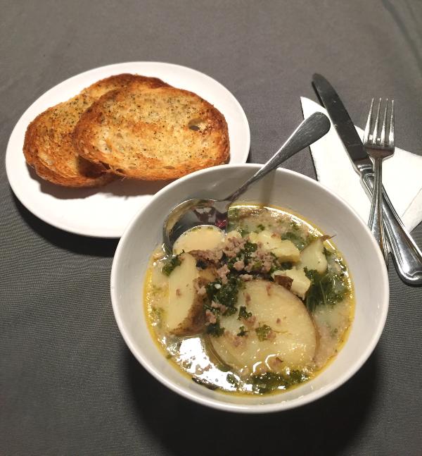
Zuppa Toscana is a relatively simple meal that could replace any of the recipes in this article. You can use up the potatoes that are starting to sprout and the sausage that’s been in the freezer for a year. The soup is in the intersection of the bottom and right guide lines. The plain background contrasts with the white dishes and helps them stand out.
Overall Design
This is a simple and bright magazine spread. The contrast between the white background and the dark orange and browns of the soup makes it seem like, by making this meal, your kitchen can achieve a happy and cozy feel. The article uses the rule of thirds expertly to fill the page without making it look too busy or cluttered. There is plenty of white space between the items to balance it out. The types used are distinct and compliment the article. I enjoy the thin slab serif of the title. It is an eye-catcher without being in your face.

Leave a comment